1. Types of Data
2. Qualitative/Quantitative Data
3. Data Collection
4. Stem and Leaf Diagram
Data in Math, is generally a measure of some facts.
However, there are different types of data that can be measured or studied, such as discrete and continuous data examples.
There also happens to be different but effective ways to record certain data, such as tally counting.
Types of Data
The two main types of data are QUALITATIVE DATA and QUANTITATIVE DATA.
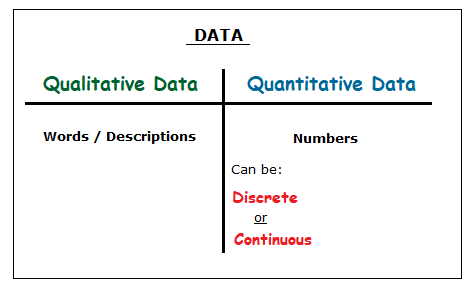
Qualitative Data / Quantitative Data
– Qualitative Data is simply words and descriptions.
Such as:The weather is raining. The soup in the bowl is hot. My dog is brown.
– Quantitative Data is numbers.
Though as seen in the table above, this data does fall into two different categories, discrete and continuous data.
Discrete and Continuous Data Examples,
Quantitative Data:
The big difference between discrete and continuous data is:
DISCRETE DATA is counting. CONTINUOUS DATA is measuring.
Example of Discrete Data:
How many films are being shown in a cinema? 5 films
Example of Continuous Data:
How long does each film last for? 2 hours
Example of Discrete Data:
How many stops a bus makes on a route? 20 stops
Example of Continuous Data:
How many miles is the length of the bus route? 14 miles
Data Collection
Both types of data mentioned can be collected and recorded, depending on the type of information you were looking for in a situation.
Both types of data could be collected if you were wanting to ask friends or family about movies.
QUANTITATIVE DISCRETE DATA QUESTION:
The number of movies a person watched during one week?
QUANTITATIVE CONTINUOUS DATA QUESTION:
How many hours did a person watch movies for?
QUALITATIVE DATA QUESTION:
What was the genre of the movies that were watched?
As seen, different questions can ask for different types of data, even if the questions happen to be about the same topic.
Tally Counting and Tally Charts
One of the most effective ways of recording data is with a tally chart featuring tally marks, particularly for quantitative discrete data involving counting.
Let’s say we wanted to count how many cars drove down a road.
With tally counting, we begin by drawing a small vertical line to represent each car seen driving down the road.
(1) (2) (3) (4)
But when we get to the 5th car, this is where we draw a horizontal line through the 4 vertical lines already drawn.
(5)
We then carry on counting by starting with single vertical lines again, but also doing the same horizontal line with the next fifth car, and so on.
So if a total of 18 cars on the road tallied would look like: |||| |||| |||| ||
The horizontal lines and gaps make the total amount easier to read and keep track of, as opposed to 17 vertical lines:
|||||||||||||||||Example
A tally chart could be used to if we wanted to collect data about a group of peoples favourite flavour of ice cream.
| Drink | Tally | Total |
| chocolate | |||| |
|
| strawberry |
|
|
| vanilla |
|
Strawberry was the most popular flavour of ice cream among the group.
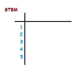
Steam and Leaf Diagram
Something called a stem and leaf diagram can be another effective method of collecting and recording data.
We may want to record the ages of a random group of 14 members of a golf club.
{ 22 , 24 , 18 , 31 , 33 , 44 , 47 , 20 , 25 , 39 , 32 , 51 , 27 , 33 }
We can see that his random group of members range from the teens up to the 50’s.
Setting up a stem and leaf diagram is good practice for situations like this.
The ages of the group range from teens to 50’s.
We set up a stem and leaf diagram with the first tens digit of each age written in a left hand column. This is the ‘stem’ part of the diagram.
Next we fill the right side of the diagram up, with the units digits of the members ages listed in order.
So each unit for a member age is a leaf of each stem, which makes up the leaves of the diagram.
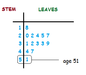
Looking now at the completed steam and leaf diagram, each row represents the members ages in teens, 20’s, 30’s, 40’s and 50’s.
- Home ›
- Probability and Statistics › Data Types